
 March 4: Was it a French photographer that made a friend of that unwelcome stranger of the medium; colour?
John Batho, born on this date in 1939 is a French photographer, whose work, though largely overlooked, adds to discussion around the pioneered the ‘The New Colour’ photography in Europe, debated by Martin Parr in his catalogue to an exhibition that ran until July 20, 2007 at Hasted Hunt in New York (the gallery folded in August 2015), wittily entitled Colour before Color. Parr, who is recognised for his own blindingly saturated colour work, explained:
The purpose of the current exhibition is to demonstrate that an equally lively colour photography culture in Europe was operating both before and during the 70s. This work had been largely overlooked as it was not put together as a movement, nor was it promoted by high profile institutions.
In Camera Work, No. 22, April 1908, p. 13, Edward Steichen stated with conviction that “Colour is here to stay’, after having experimented with the Autochrome, launched in June 1907 by the Lumière brothers as the first practical industrial colour process. On a glass support these images required viewing in transmitted light or by projection and could not be printed.
Despite Steichen’s announcement, after its launch in Paris in June 1907, though it roused lively debates amongst art practitioners, colour proved not to dominate in their photography in subsequent decades. The technologies that followed the Autochrome, which allowed printing of colour in media and advertising, were expensive and laborious, and out of reach for most artists.
When the cheaper option of transparency film and eventually colour printing in the darkroom became available after WW2, amateurs embraced the medium, causing ‘serious’ photographers to regard it as obnoxiously commercial and populist.
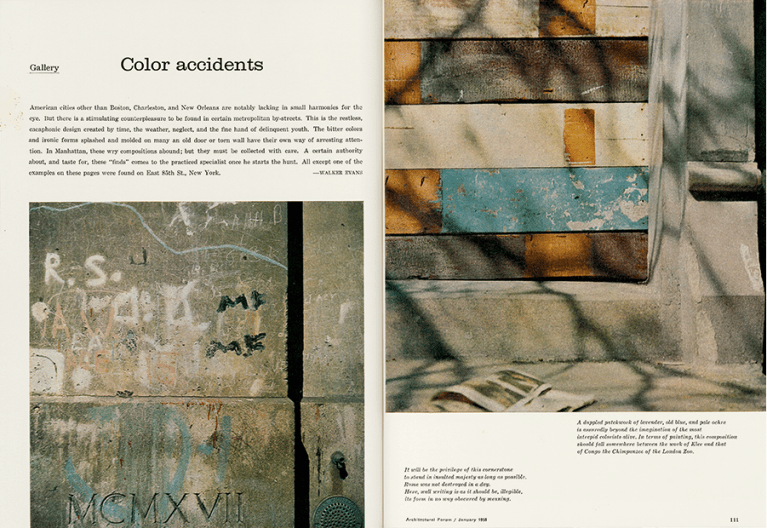
Though American photographer Walker Evans (1903–1975) himself was commissioned as early as 1948 for colour photography by magazines (above), in an essay ‘Photography’ on his work in Quality : its image in the arts edited by Louis Kronenberger and Marshall Lee (1969) he vehemently summarises the commonly accepted view:
Color [sic] tends to corrupt photography and absolute color corrupts it absolutely. Consider the way color film usually renders blue sky, green foliage, lipstick red, and the kiddies’ playsuit. These are four simple words which must be whispered: color photography is vulgar.
When the raison d’être of an image is precisely its vulgarity or the color-accident produced by the hand of man, and not that of God, then only a colour film can be used validly. […] Most of the time, color can only be used well when the photographer is an artist with a perfect taste

That photographer, for Evans, was Marie Cosindas (*1923) who exhibited colour in 1966, though in an interview with Leslie Katz (c.1918–1997) for the March-April 1971 Art in America he was still saying “if you tone it all down it’s just about bearable, and that’s the only thing you can do with it, make it as monotonous as possible.” Late in his life however, Evans took up the SX70 Polaroid’s gaudily coloured little squares for artistic purpose which no doubt appealed to his own ‘raison d’être’ for photography: as an avaricious collector of things and people, for ‘typologies‘.
In the 1970s attitudes gradually shifted. When in 1981 Sally Eauclaire (*1950) released her compilation of The New Color Photography supported by a show of the same name at the International Centre for Photography (ICP), New York, The New York Times on November 8, 1981 published a lukewarm review, but art photographers were paying colour more attention, and not only in the USA.
In France, the first incursion of American colour photography appeared at the Zabriskie Gallery which, for the installation of its Paris branch (it opened in New York City in 1954) at 29 rue Aubry-Le-Boucher in the 4th arrondissement, devoted its opening exhibition from January 29 – March 5, 1977 to Current Trends in the United States, to include the main representatives of colour photography; William Eggleston, Stephen Shore, Joel Meyerowitz and William Christenberry (the latter’s first showing of colour photographs having just come off the walls of Zabriskie Gallery, New York on 8 Jan. 1977).
Rencontres Internationales de la Photographie festival in Arles in the summer of 1977 amplified the colourist trend in American photography in an exhibition entitled The second generation of photography in colour (which later travelled to Photokina 78 in Cologne, Germany) with public screenings of 350 to 400 slides, the initiative of Allan Porter, editor-in-chief of the French-language Swiss magazine Camera. In its November 11 1976 issue, he published a portfolio of six photographs by Eggleston, accompanied by an excerpt from the introduction of William Eggleston’s Guide by John Szarkowski.

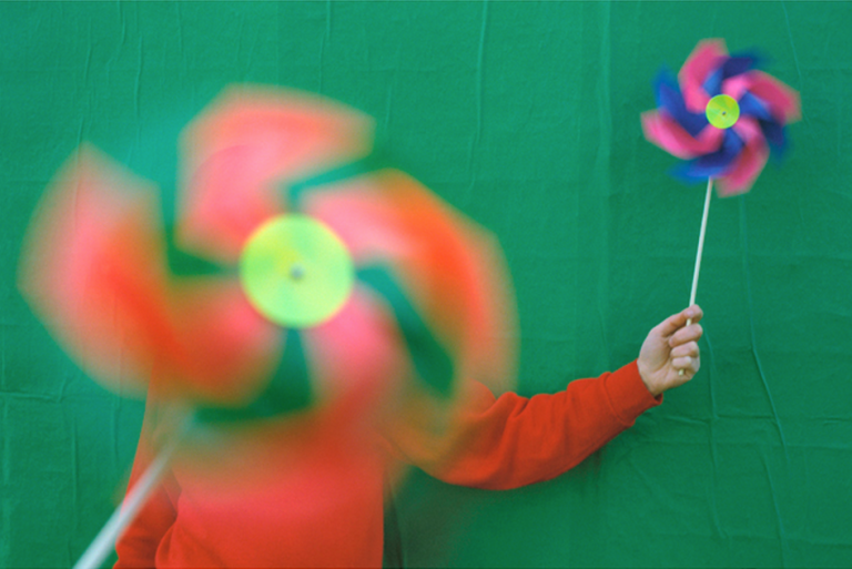
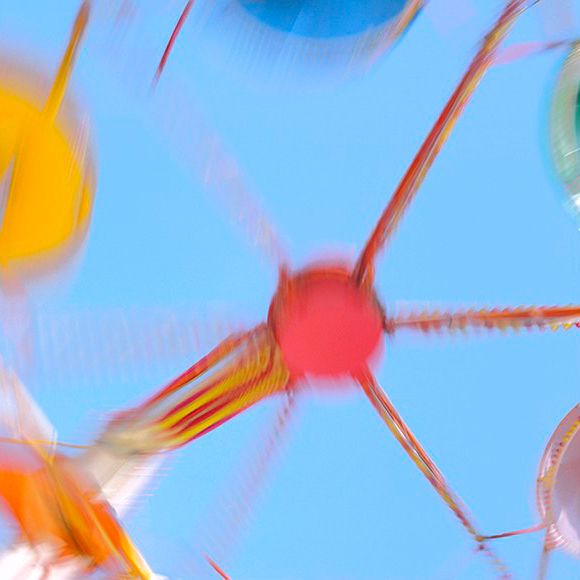
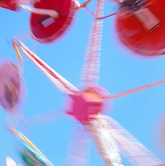
Against this background of the 1960s, John Batho’s decision to apply colour to creative photography, in which the defining norm was black-and-white, was a militant act. To practice colour in the years 1960-1970, the reversal process of chromogenic development for transparencies, like Ektachrome, was the most accessible.
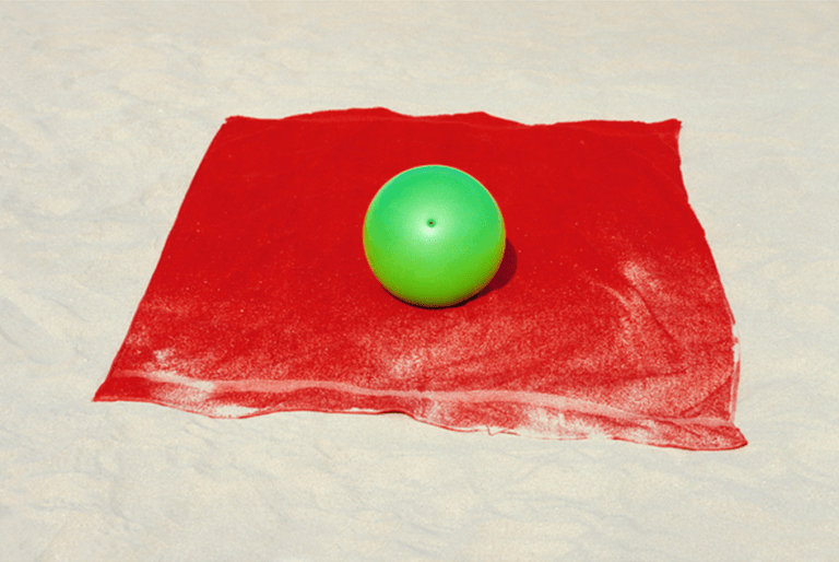
This 1975-1986 series Photocolore gives some idea of the nature of his unpublished earliest series Chemins creux (1962), Héry, pays de Savoie (1964), Honfleur, couleur locale (1967), Normandie intime (1967) and Paris – banlieue (1968). Broad fields of pure colour are nuanced by clouds, transparency caused by blur, or the traces of action such as the sand that scumbles the edges of the red towel on which sits a green ball in eyeball-stuttering contrast. The colours are so saturated as to ghost retinal afterimages over adjacent fields as the eye wanders over the image.
As Jean-Claude Gautrand emphasises in December 1977 in Le Nouveau Photocinéma, choosing the ‘slide’ the medium of ‘everyman’ Batho’s ambition was nonetheless to “elevate the practice”, in face of the prevailing attitude that colour photographs are those taken by amateurs on their holidays;
I have made the bet that with this process I will succeed to do creative work


As a member from 1968 of the Photographic Club of Paris 30 x 40, founded by Roger Doloy in 1952 Batho hears and meets prominent American visitors to Paris Ralph Gibson, Harry Callahan and others. Despite their reinforcement of the monochrome dominance of art photography, he regularly presents his images in colour. At a session in April 14, 1977 he presented 250 slides tracing a chronology of his 15 years of practice in colour photography along with paper prints made with the Fresson process, the printing method in which he had been experimenting since January with Michel Fresson.
For John Batho, this change marks a turning point. While the slide presented a diaphanous image, the carbon print on paper, practiced in the Fresson family for three generations, makes colour material. The 1899 monochrome printing technique Theodore-Henri Fresson (1865–1951), kept secret within the circle of the family, the photographer Jose Ortiz Echague and the workshop of Luis Nadeau in Canada, was adapted for the production of four-colour prints by Pierre Fresson in 1952 and used by several French photographers practicing colour, including Frank Horvat, Lucien Clergue, Bernard Plossu, Bernard Faucon and Sarah Moon.
The depth and quality of Fresson colour at this time in the mid-seventies was incomparable with anything that could be done with the still-developing chromogenic processes. William Eggleston used the dye-transfer process for his prints but he was rare as an art photographer in being able to afford the prohibitive expense.
For others, Ektacolor (with a yellowish cast), and Cibachrome/Ilfochrome (then much more vivid that prints from negatives) did not become practical until 1969 and not in widespread use until the early 70s. Neither of those processes could offer the permanence and stability of conservation to which Fresson could lay claim, encouraging institutions confidence to add these prints to their collections, which they were then reluctant to do with transparencies and chromogenic prints. Le Figaro, on May 2, 1978, announced:
…last autumn, a stranger succeeded the prodigious success of obtaining the first Kodak Prize for Photographic Criticism, to be commissioned by the Zabriskie Gallery…to be shown at the Museum of Modern Art while an exhibition was planned in New York and another in London. His name was John Batho. He had worked for fifteen years in the shadows and in silence.
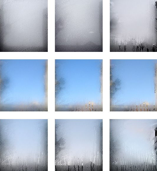
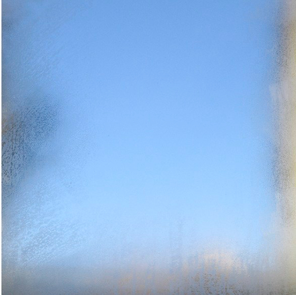
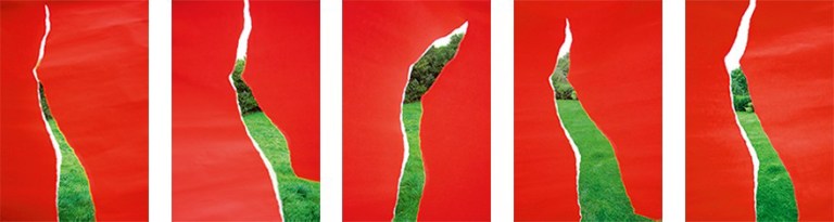
Since then Batho continued his experimentation in colour, drawing on philosophies of colour from Goethe and Chevreul concentrating on the composition of light as colour in exercises that take a blank sheet of etching paper or a fogged window as the canvas.


In Surfaces an apparent overlay, a white square, appears against the background of skylit water. It is only the evidence of reflection that we come to realise that this is realism; the white square is planted in the water, leaning at an angle away from us that permits Batho to shoot so that water fills the frame to the edges, to which the square itself is aligned in exact parallel.


These appear to be lessons in relative colour like those if painter/designer Josef Albers (1888–1976) in his experimental Homage to the Square, published in his widely influential book Interaction of Color. However Bathos’ great square is not neutral but changes according to exposure and its reflection of the sky;
black and white concentrates but also reduces the image to the relations of values; I prefer the colour because with it, the image obtained seems to me more alive and more complete. […] The colour participates in the being of things, the grass is green, our hair is blond, chestnut or black, etc. I conceive of my photographs from this observation, considering colour as constitutive, without dissociating it from the other elements of the image.
- John Batho (2016) Peintures


4 thoughts on “March 4: Couleur/Color”