 January 13: “It was my dream to make public pictures that could be seen by as many people as possible,” said Roman Cieślewicz. “Hence the top importance of the poster—the street picture.”
Cieślewicz, born on this date in 1930, was one of the world’s most significant graphic designers. He used a wide variety of media to produce his imagery, and amongst these was photography. Not a photographer himself, he nevertheless used the medium in a manner from which we, with the luxury of digital imaging, can learn.
While film posters in the West were often vehicles for Hollywood stars, Polish poster designers were free to bring to an idiosyncratic style and interpretation to promotion of the same films. Here are the original broadsheet poster for Hitchcock’s Vertigo and Cieślewicz’s version.
We know American Saul Bass as the designer of the American poster, which is actually the only poster he did for Hitchcock; he worked only on titles for two others. His skewed, blocky typography and the cutout silhouetted figures, drawn by Art Goodman, are sucked into a spiral pattern designed by experimental filmmaker John Whitney. It is a team marketing effort, and in many iterations of the poster photographs or drawn art featuring the main actors, and even of the director, are added, confusing the design.
Cieślewicz’s poster has been made by the designer alone, though working with an anonymous others’ photographic material; the fairly generic skull image. He does not take the title literally, instead the only reference to the spiral that the word ‘vertigo’ (zawrót głowy in Polish) suggests, is the target on the forehead of the skull. The murder conspiracy, obsession and assumed identity that drive the plot are his main concern. By adding two blank white streaks below the title over the throat of the skeleton figure, the highlights of the skull image become arms of a full-length figure superimposed on it and beating it with fists raised.
Cieślewicz called his home country Plakatodrom, ‘the largest testing ground of the poster in Europe.’
In the 1890s the poster aligned with ideals of the Ruch Odnowy Sztuki Rzemiosł or ‘The Movement for the Renewal of the Art and Crafts’, the Polish version of Arts & Crafts Movement. Poster design was seen as an accessible art form, and this notion of posters being Art for the ‘man in the street’ remained an important ideal up into the 1950’s. In a country which has struggled to maintain it despite continued invasions, national identity was integral to poster art from early in the 20th century; the Society of Polish Poster Art, founded in 1902, favoured the incorporation of traditional Polish folk designs.

After WW2 which cost the lives of 6 million Poles, and a Communist regime was established that prohibited advertising, it is a wonder that graphic designers, let alone the poster, survived in Poland.
Fortunately, during the 1950s posters were state sponsored for promoting cultural events such as theatrical productions, films, musical performances, circuses, sporting events and zoos, to promote health and safety, and to encourage tourism from outside Poland.

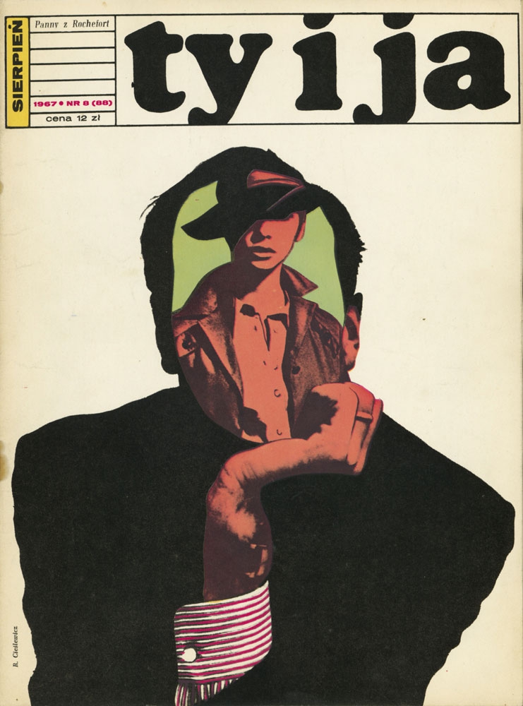
The organisations turned to artists and art school teachers for designs for their posters, the core group identified as The Polish Poster School included Jan Lenica, Wiktor Górka, Roman Cieślewicz, and Waldemar Świerzy. Cieślewicz was designed large numbers of movie posters and was artistic editor of Ty i Ja (‘You and Me’) monthly (Warsaw) 1959-1962. It is the interweaving of text with image which distinguishes his design.
He then moved in 1963 with partner and sculptor Alina Szapocznikow, to work expatriate from France as art director of Vogue, Elle (1965-1969), Mafia advertising agency (1969-1972) and was artistic editor of Opus International (1967-1969), Kitsch (1970-1971) and Cnac-archives (1971-1974). His teaching at the Ecole Superieure d’Arts Graphiques (ESAG) in Paris has been a major influence on late twentieth century design.
Of his decision to move to France and his first breaks there, he says:
I wanted to leave Poland to see how my posters would stand up to the neon light of the west. I dreamed of Paris, but went first to Italy because of Eugenio Carmi, the art director of Italsider, a large iron and steel manufacturer in Genoa [who gave] me a commission for five photomontages for the entrance hall of the manufacturing plant…On a later visit to Paris I met Peter Knapp, the photographer and art director of Elle. He had seen and liked You and Me, and commissioned me to design photomontages for various columns, including the horoscope page. Soon after this, he asked me to work on the layout of the magazine […] I was dazzled by this journalistic machine: 200 people working to produce 250 pages that would end up in the bin the next day.
During my time at Elle, where I later became art director, I met many people who gave me work. The publishers La Hune, Christian Bourgois (10 / 18 collections), Maimé Arnodin, Hélène Lazareff, Edmonde Charles Roux, among others – major figures in the press and publishing world at the time.
Where has poster design gone? Yes, posters are still designed, but they compete for attention with the web and with other advertising media. Can it still be called the art of the people? We find another manifestation of this imagery, the kind espoused by Cieślewicz, in contemporary street art. To compare it to the graffiti of Banksy, for example, one finds the same flat treatment of forms, the economy of design and the clarity and wit in communication.
Both artists are using stencils to make their design, screen print in the case of Cieślewicz, and cut-out paper and aerosol paint in Banksy’s, who started using it out of the necessity to be quick to avoid detection and arrest.

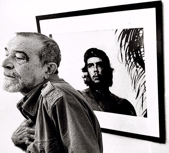
Tone drop-out photographs as the basis for design in posters and street art heighten the recognisably and visibility. Using stencils or screen printing simplifies their production but the truncated tonal values of the image requires judicious selection and editing to produce an effective image. The high contrast and symbolism of Korda’s Che makes it the photograph used more than any other; in Cieślewicz’s case for the October 1967 cover of the French art magazine, Opus International, with the words “‘Che’ Yes” replacing eyes and nose, probably the earliest reuse of Korda’s photograph.
Cieślewicz, responding to a 1993 interview by Eye magazine said:
Kamikaze’s use of black and white in 1975-76 inspired me to return to photomontages (not collages, as people sometimes call them) [which] gives a richer result than straight graphics […] It is a form of expression that I find appropriate to our times, perfectly adapted to contemporary mass media.
I use all manner of techniques: photography, painting and watercolour, but not drawing. I have a constant source of inspiration: circular forms. I’ve often used the offset screen, which I discovered at Elle, to focus on a detail of a photographic enlargement. The flexibility and round form of the screen dots make it possible to bring out each gesture of the subject. Also, because I couldn’t afford silk-screen printing equipment, I used felt pens to fill out the areas between the screens. I effectively made the screen dots by hand.
A lack of equipment and the need to visualise ideas immediately resulted the need for a hand-made reproduction of mechanical techniques, the many imperfections of which he found ‘very pleasing’.
A Poster is an idea. This is what matters. An idea can excite, can be intriguing… it was Marcel Duchamp who said “an image, which does not provoke is unworthy” and he was right. We are surrounded by images. We are hit by tens of thousands of advertisements every day. We may or may not accept them. The image is not neutral. It cannot be. It must shout, it must intrigue, it must do something which enables us to think. – Roman Cieslewicz, 1978.


2 thoughts on “January 13: Poster”