
 December 5: There was a time when Italian design produced what all desired. Did its photography share in that glory?
Do we credit this eminence to the ubiquitous remains of Roman architecture, sculpture and typography and Florentine Renaissance and Venetian Baroque art? Or did it rise due to the era of postwar prosperity after the Marshall Plan until the late 1960s, when Italy enjoyed the “Economic Miracle” and saw it become a world trend-setter in design? Did Italian photography participate in this shift?
We might discover the answer in an exhibition entitled Developing, slated as ‘an exhibition of Italian experimental photography from the 1960s to the present’, that opens today at SR Contemporary Art Berlin Niebuhrstr. 11A, 10629 Berlin in a new space, its second, in Charlottenburg.
The show is not a national survey, though SR Gallery director Sabrina Raffaghello is clearly a formidable collector and curator, having attracted a group of very significant representatives of Italian photography, Franco Fontana, Luciano Romano, Alessandra Baldoni, Franco Grignani, Patrizia della Porta, Occhiomagico, Ivan Piano and Barbara La Ragione into her stable.
Photography in Italy established its identity alongside the advances of Italian design, emerging as a distinctive regional variation of the broader European movements the 1960s.

- Franco Fontana (1985) Houston
Franco Fontana (*1933), whom I discussed in brief about a year ago, is now a veteran of 84 and serves to typify the Italian approach in his abstracting distillation, through the use of strong, sun-saturated colour for landscapes urban, marine and rural, nudes and architecture, all on 35mm.
Having taken up photography in the 60s at the dawn of this boom era he was being exhibited as early as 1963 in Vienna, in 1965 in Turin and in 1968 in Modena. With over 400 solo and group shows since, several of which are preserved in photobooks, simultaneously he was being commissioned for advertising campaigns for major firms and corporations and illustrations for Time, Life, Vogue (USA and France), Venerdì di Repubblica, Panorama, Frankfurter Allgemeine Zeitung and the New York Times.

- Faranco Fontana (1978) Puglia
His approach is shared by the next generation of Patrizia della Porta (*1954) and Luciano Romano (*1958). Della Porta specialises in images of contemporary architecture, made in monochrome for passages solid black and graduated greys highlighted by paper white. She can be seen also as a beneficiary of the upturn Italy’s economic fortunes; in 1969 at the age of fourteen she won an award from UNESCO for the Parthenon Prize ‘Photo of the World Family’.


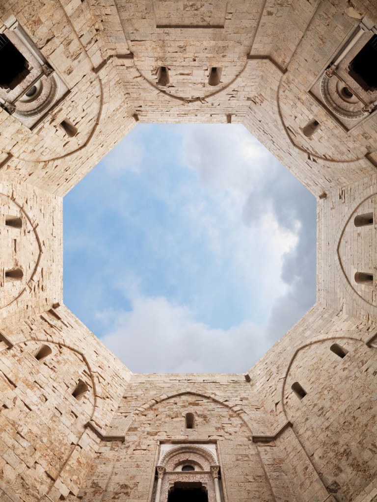
Romana’s architectural imagery, both commercial and made for personal interest, is framed with absolute precision, is consistently crisp and clean and rigorous in its high level of finish. Like Fontana, he taps into the pittura metafisica qualities of classical architecture beloved of Giorgio de Chirico.


Gallery director Raffaghello includes Franco Grignani (1908—1999) as the earliest and oldest of the group, and indeed, his strong design aesthetic operating in his work is clearly influential in the formation of a Mediterranean style, and on a group of the younger photographers in this show. Constructivism, Op Art, and abstraction contribute to his work, but he came to photography out of a practice as a designer, and his scientific interest in the nature of visual perception was prompted by his war experience as a bomber navigator.
You’re in Australia when you’re reading OnThisDateInPhotography, and there is an Australian connection with Grigniani; in 1963, the International Wool Secretariat, now called Australian Wool Innovation (AWI), announced a global design competition to create a graphic identity for wool.
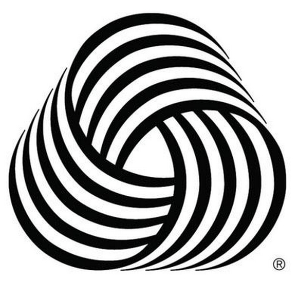
The resultant logo, inspired by a ball of wool was the winning design and known as the Woolmark. No doubt you recognise it, but questions remain about who was the designer. It is officially credited to a Milanese ‘Francesco Saroglia’ who won the competition, but on its website, the Alliance Graphique International (AGI) asserts that Franco Grignani entered the competition using a pseudonym because he was actually on the jury to choose the winning design, a version of events that is supported in Ben Bos‘s 2007 book, AGI: Graphic Design since 1950;
Grignani was a member of the jury but he couldn’t resist the temptation of taking part himself, the subject being ideal for his design approach. He played it correctly and won. He entered under the alias of Francesco Seraglio [sic].
Celebrated designer Massimo Vignelli (1931—2014) concurred;
I have no doubts in attributing the Woolmark logo to Grignani. It is typical of his visual language. I never heard of any other work by [Francesco Saroglia], and the fact that Grignani was on the jury justifies that he had no official entry in that competition. Saroglia may very well be a pseudonym, or just a body, but not a real designer. If he really existed, his name would be associated to other outstanding works in a similar language. No works, no person
Grignani’s pre-1963 posters for Alfieri & Lacroix feature black and white stripes, and in a feature in Graphis magazine issue 108, published in 1963, Grignani showcased a series of black and white “graphic experiments”.

The roots of this imagery extend from 1926 when he intuitively adopted dynamism and representation of movement in his drawing, coeval with developments in Italian Futurism:
…the theories of futurism were so congenial to me that even before reading the plastic dynamism of Boccioni every time my pencil was drawing it produced lines of force for series of ovalized curves in an interpenetrated dynamism .

He was convinced that photography and the processes connected to it were prosthetic to the human eye and enhance our vision.
I look for what does not exist, what is beyond reality. The human eye has limits, at a certain point it does not go further. Even our eye is calibrated. Speed therefore obliges the mind to intervene to compensate for the difficulties, the uncertainties of our eye. So I alter the perspective, I look for impossible shapes, I enter the labyrinth of distortions.
 Here Grignani readily accommodates the “modern spirit” in photography represented by Antonio Boggeri’s yearbook Luci ed Ombre (‘Light and Dark’) published by Il Corriere Fotografico magazine between 1923 and 1934, in which Italian photography can be seen progressively becoming “modern”.
Boggeri promotes the idea of “the aristocratic simplicity of style” of the “new” Italian photography in relation to the international scene and the new relationships between photography and graphics. The 1928 Salon II and the Natura photographic competition in 1929 also advanced ideas that might be considered a first ‘manifesto of the new vision’ recognising the nature of optical truth in photography and which keeps alive the debate on what is meant by “modern” photographic aesthetics.
Supporting this is Gio Ponti‘s Discourse on photographic art published in 1932 in the magazine Fotografia which emphasises the distance of photography from painting and affirms its autonomy of language, reinforcing Moholy Nagy‘s thesis in Malerei Fotografie Film (1925) and his article On the future of photography published in Italian, also in 1932, in the same magazine.
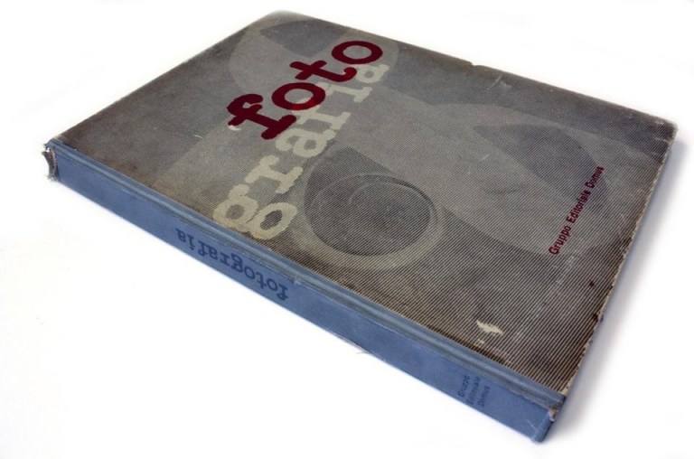
The Yearbook of Photography, with 171 photographs by 114 authors, was published by the design magazine Domus in Italian and German, in February 1943, toward the end of WW2 at the threshold of the fall of Fascism in both the allied countries. Gianni Mazzocchi (1906—1984), then editor, presented it as follows:
I wanted, with the edition of this volume, to affirm the technical and artistic maturity of Italian photographers. It is the first time in Italy that such a complete review is published and this documentation of the art and technique of our photographers will also erase the ancient prejudice of a foreign superiority in the photographic field. The magazine Domus […] since 1928 has contributed to the diffusion of a modern Italian taste […] .
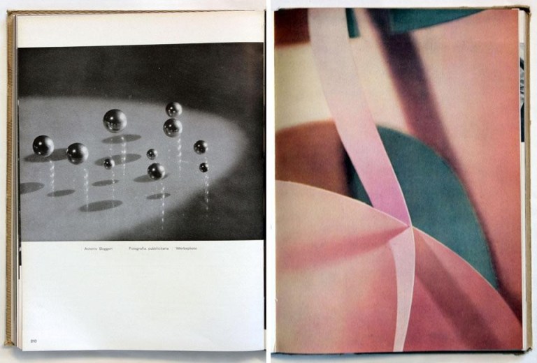
The yearbook recognises and highlights contributions from the world of graphics with its inclusion of Franco Grignani along with Antonio Boggeri, Erberto Carboni, Bruno Munari, Remo Muratore, Marcello Nizzoli, Albe Steiner and Luigi Veronesi; all protagonists of the graphic and typographic renewal of the Triennale V di Milano of 1933 and in the monthly Campo Grafico, founded in the same year in Milan by Attilio Rossi (1909—1994). It highlights avant-garde photographic experimentations, such as the photograms of Veronesi, Grignani, Munari, Muratore and their tendency toward to abstractionism in photography that was permitted to develop in Italy under the regime – but not in Nazi Germany, from which so many practitioners of Modernism had fled.

In his 1963 GRAPHIS article Grigiani asks:
Why does a system of iines converging on a point have a hypnotic effect? Why can a sequence of lines of differing length give the illusion of motion? To answer these questions, I have carried out 6000 experiments over the years. A few of them have found practical applications; but while the results of most still lie in my cupboards, I believe they embody a contribution not without value to the future of graphic design. For the designer’s production is not meant to be framed and hung on a wall. It must survive in the press, in the streets, jostled by its competitors. It must not go down in the chaos, but must continue to emit its message on its own wavelength, achieving an almost physical life of its own.


Grignani’s first excursions into experimental photography included using extreme points of view to distance a subject from realist appearance, and use from 1928 of the photogram.


The photograph was a starting point to be attuned using blur and soft focus, overlapping multiple visions, flare from reflecting surfaces to develop a ‘short circuit of perception’, a vortex of expectation, anxiety and tension that transcends objectivity.
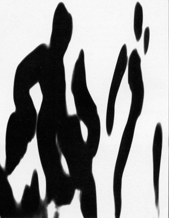
So used are we to abstract images that it is easy to dismiss them as mere geometric games and to overlook the innovator’s journey from its origin, whose drive to conduct such research was his overwhelming desire to communicate by stimulating our visual sense to connect reality, thought, idea, sign, photography.
In the late eighties I filled in for a Dutch photography lecturer who was at the end of his career and had been granted long service leave. In handing over he introduced the syllabus and I learned that I was to teach design students to use graphic arts films, Rubylith, half-tone screens, the Repromaster and outputs onto Copyproof. It required some fast revision on my part and a certain amount of swallowed pride since the gimmick of ’tone-dropout’ that he pushed was anathema to one used to urging students to use the full tonal range of the silver bromide print. Since then I have come to understand this European design tradition from which the departing lecturer had come.


While Grigiani uses these same materials, his is not an exclusively graphic approach. Where it suited he used a combination of his wife Jeanne’s drawing and his treatment of photographs and typography.


At certain stages he would intervene with rephotographs of the line-film imagery to introduce movement and blur, or place it under a sheet of textured glass to break up the forms in making a copy, or use a favourite device of reflecting an image in a distorting chrome surface. Darkroom effects included the use of high contrast and solarisation. While some work becomes entirely ‘optical’ without any apparent representation, there is usually a photographic stage in the production.


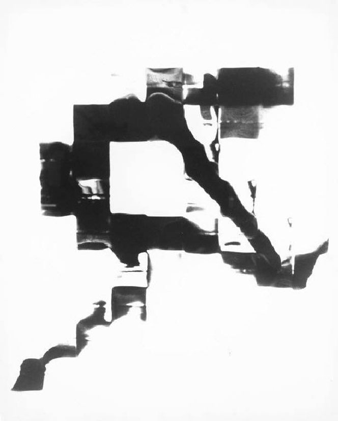 Grignani’s professional career between the post-war years and the 70s continued in editorial, advertising and graphic communication and a particular contribution to the renewal of advertising graphics were his photo-typographic images;
I was not a closed artist … but actually a participant in the evolutionary processes of the mass media, creating and proposing a new active concept of artistic doing.


Sabrina Raffaghello, in Developing exhibits another side of Italian photography through the other four artists. Each deserves space in other posts, so I will summarise: opposite to Grignani’s lineage of abstraction, they are more concerned with the inner life of imagination, dream, spiritualism and madness.
Staged landscapes inhabited by the, usually female, nude amongst impossible objects are the hallmark of Giancarlo Maiocchi aka Occhiomagico (*1949). Essentially surrealist, influenced by psychedelics, and metaphysics, his illusionist techniques now extend to digital imaging.

While Ivan Piano (*1975) also uses experimental analogue processes, including bleaching, chemigram, cliché-verre, cross-processing, hydrograph, lumen prints, oxidation, and solarization, his imagery is subjective and spectral.
 Barbara La Ragione (*1974), in a reversal of Mary Shelley’s monstrous creation, starts with masks and dolls, deformation and mutation to create characters with captivating and magnetic, but melancholy, beauty. She reflects on the fact that it is diversity that makes an individual unique and unrepeatable.
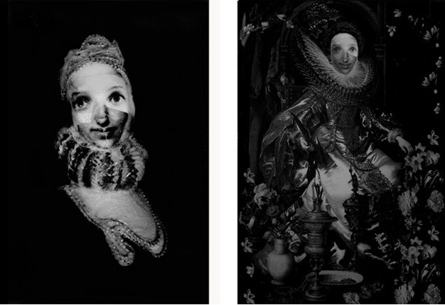
Barbara La Ragione (2013) Queen Elisabetta
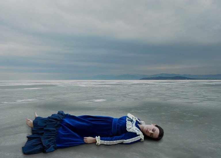
Alessandra Baldoni (*1976) reflects on everyday life through the photographic act by drawing on the other arts of theatre and literature, especially the poetry of Virginia Woolf, Amelia Rosselli, Ingeborg Bachmann and Antonia Pozzi. She stages memory, dreams, fable and love in order to remind us of our own. Operatic in the Italian taste, these are often melodramatic and histrionic, but only in order to amplify the susurration of love or the screeches of revenge.
Developing surveys Italian photography and its development. To do this by drawing on a stable of artists in a commercial gallery is an achievement, but only with some further enquiry into its commonalities, history and context can we account for that certain attraction and desirability that distinguishes it as Italian.
More information about each of the photographers Franco Fontana, Luciano Romano, Alessandra Baldoni, Franco Grignani, Patrizia della Porta, Occhiomagico, Ivan Piano and Barbara La Ragione can be pursued from the links.


One thought on “December 5: Il desiderio”